McKinleys Group: Brand Refresh
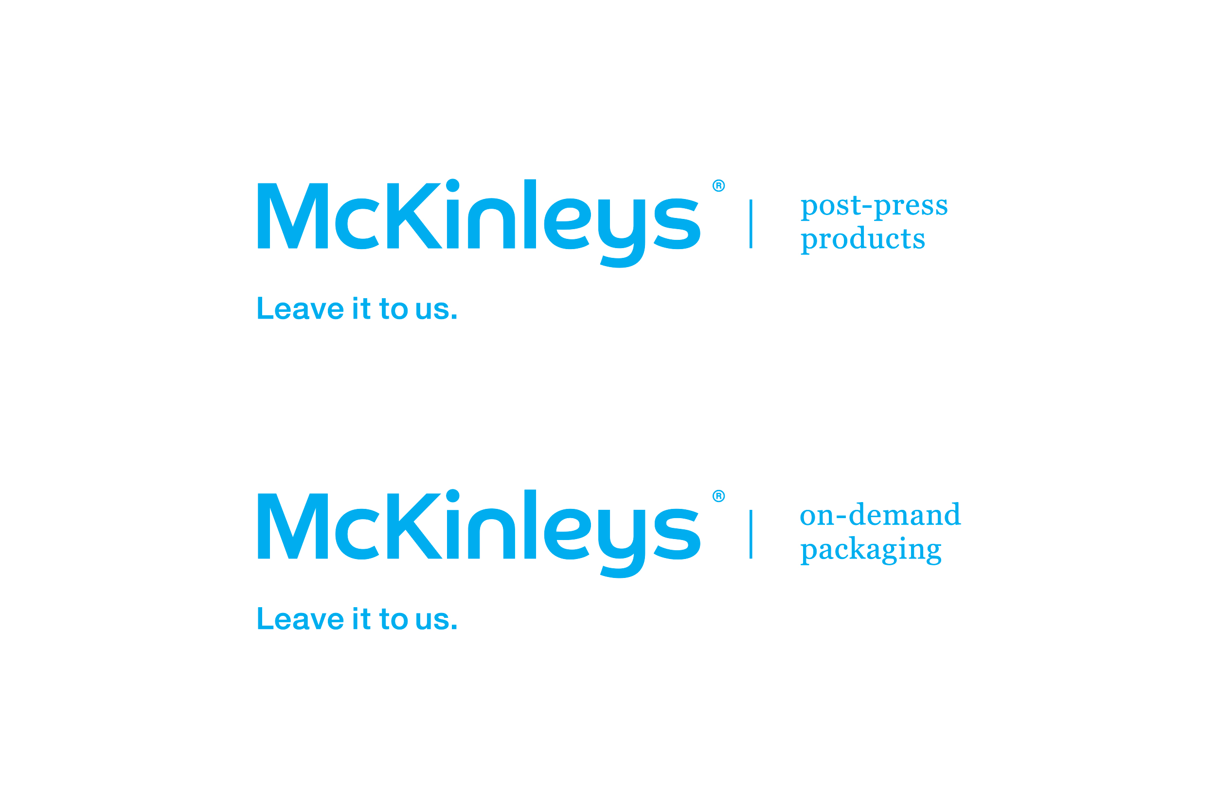
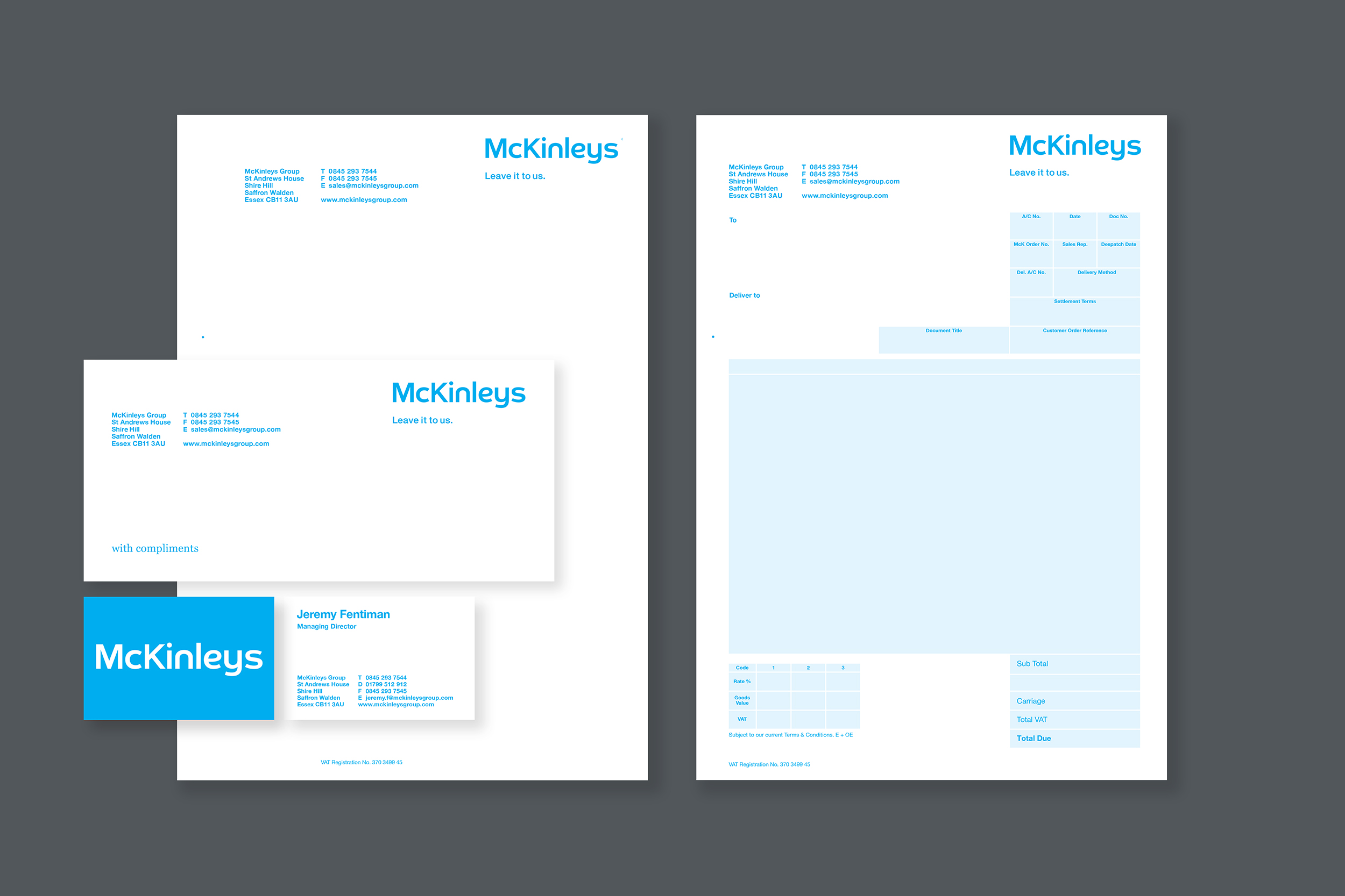
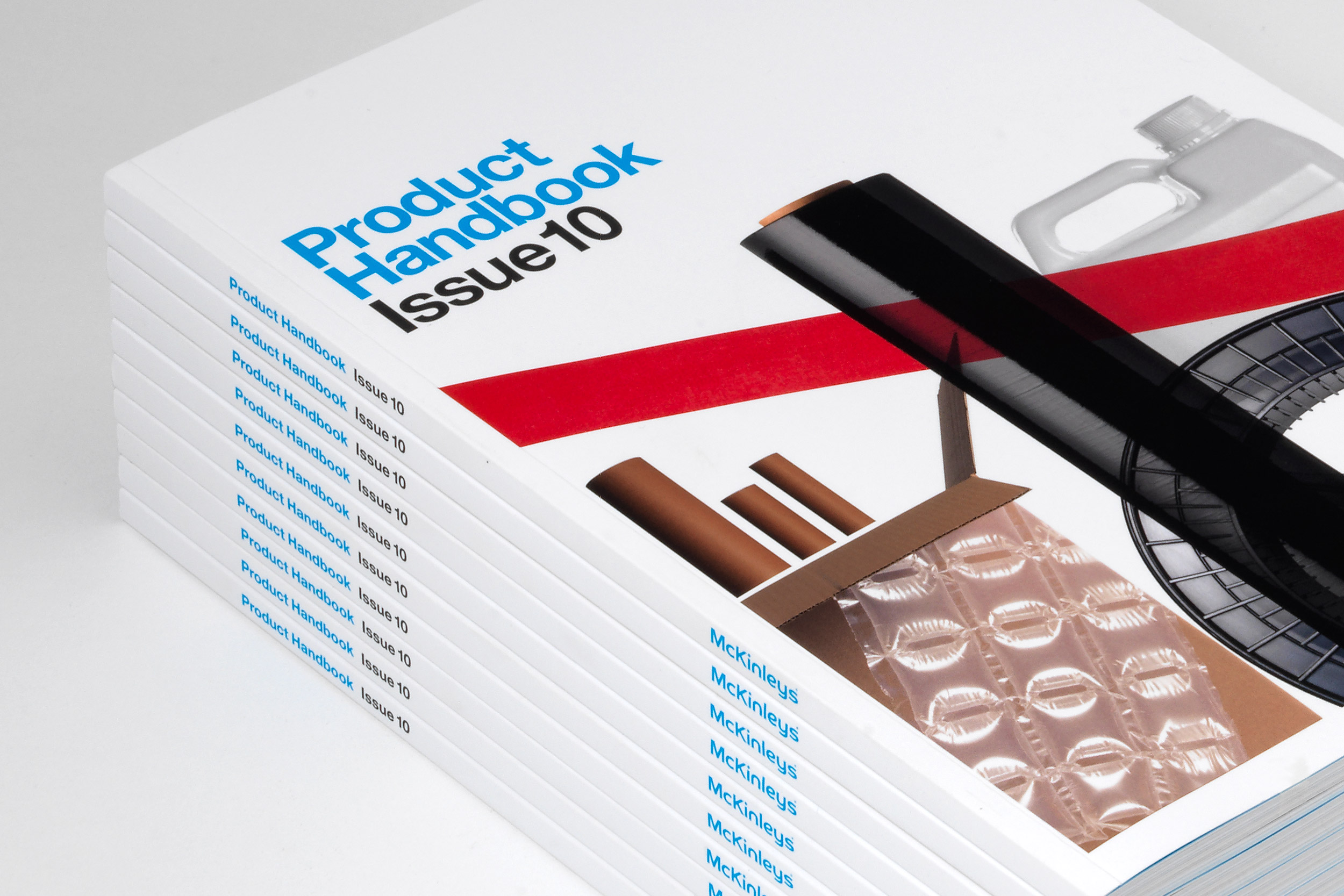
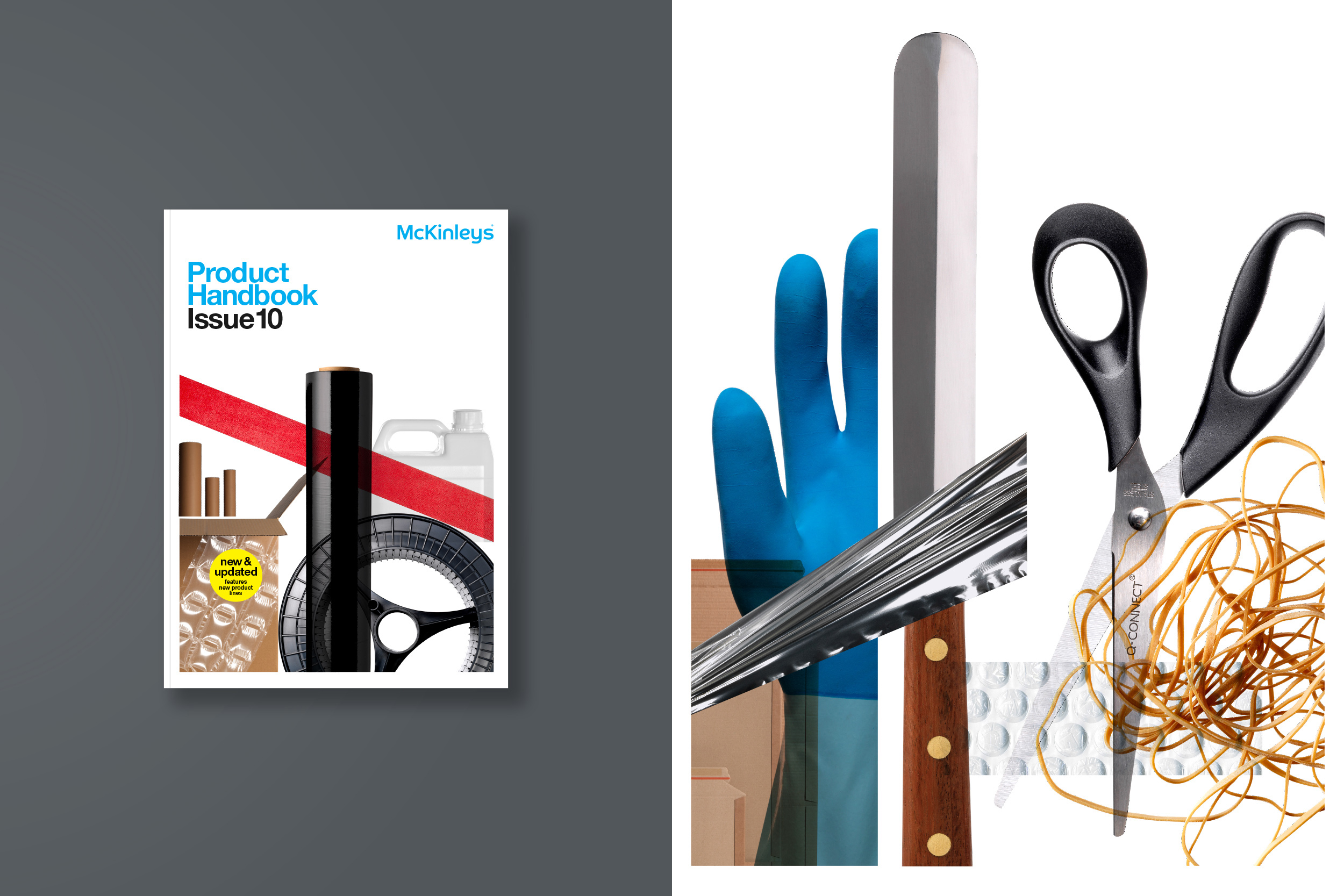
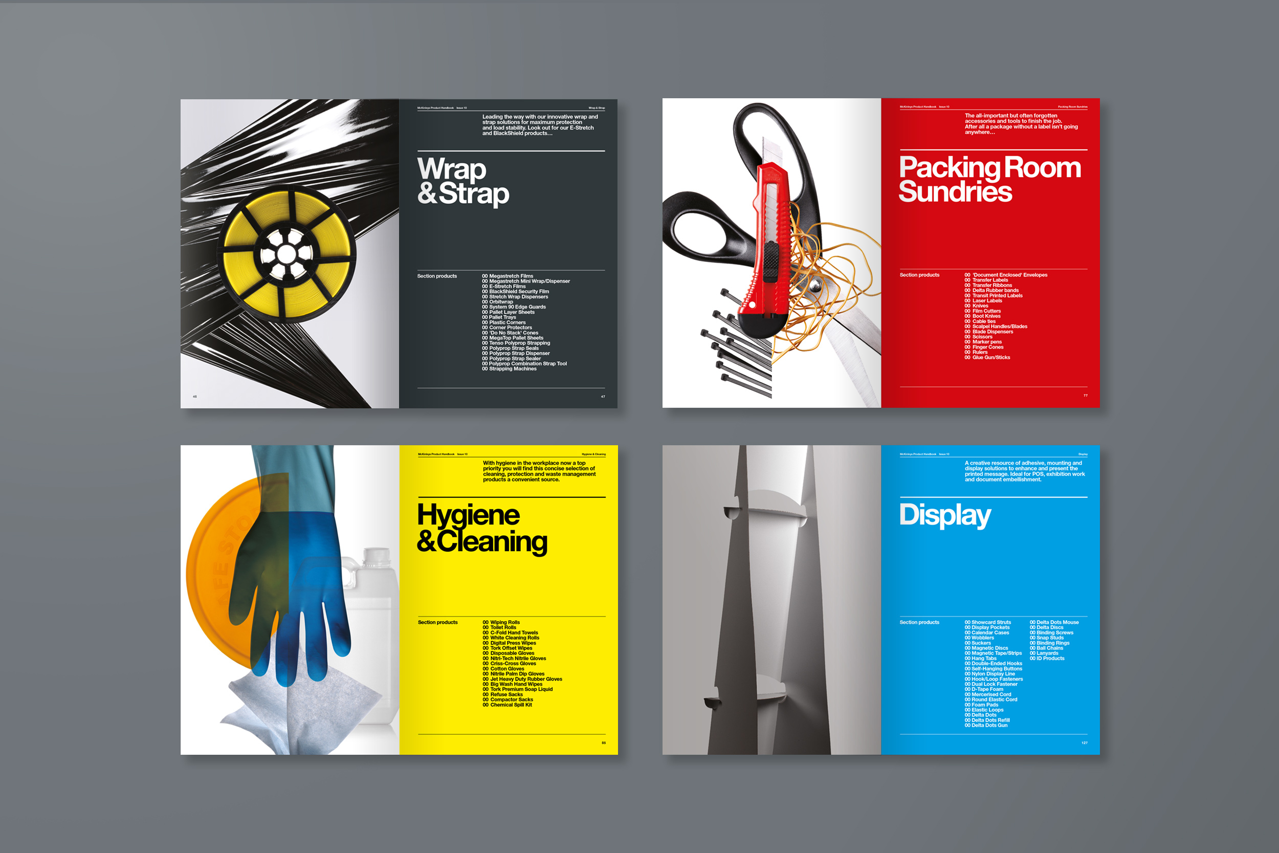
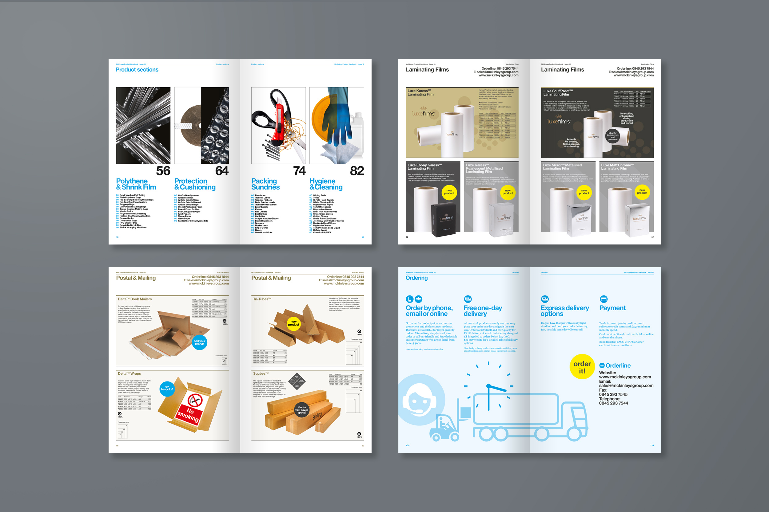
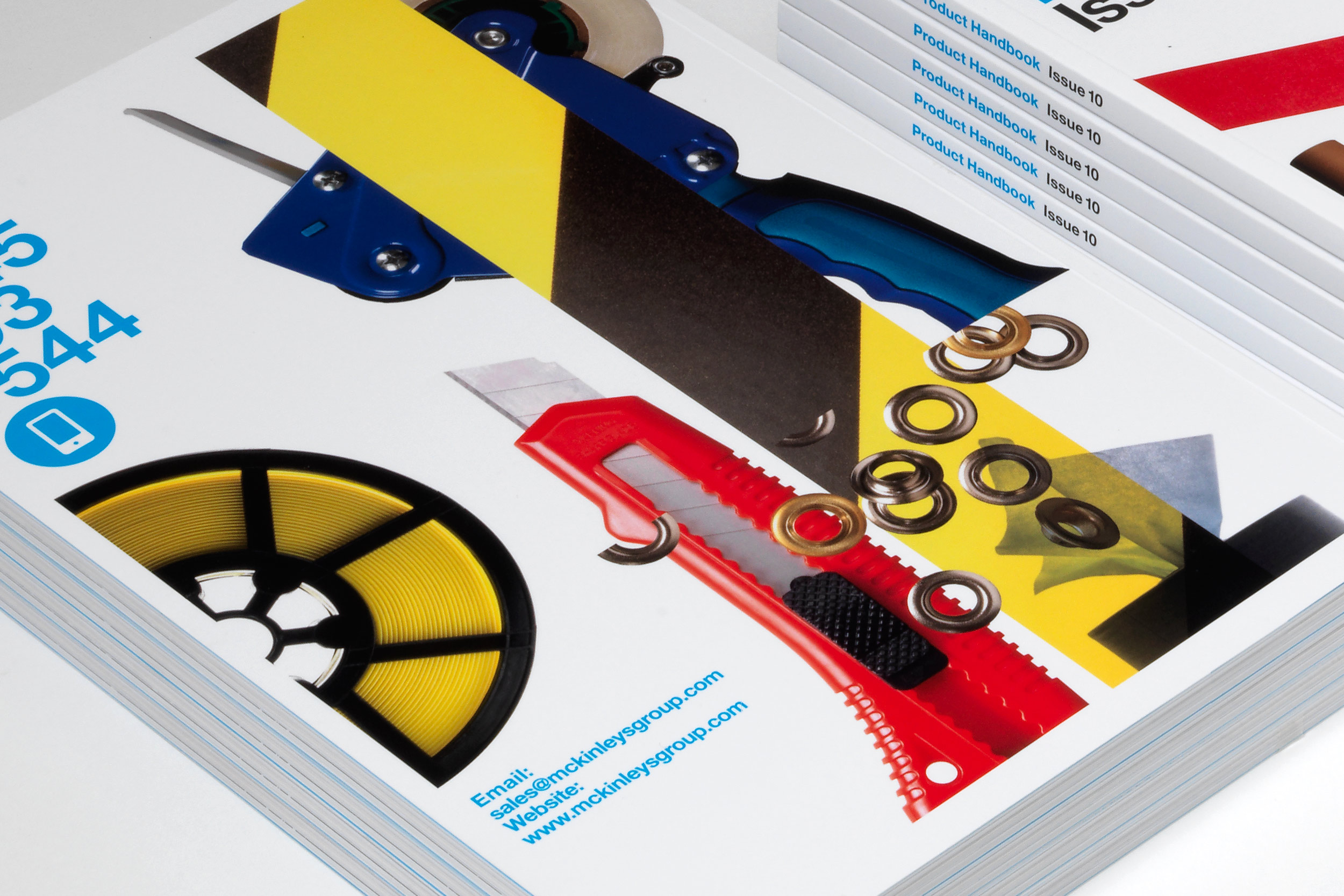
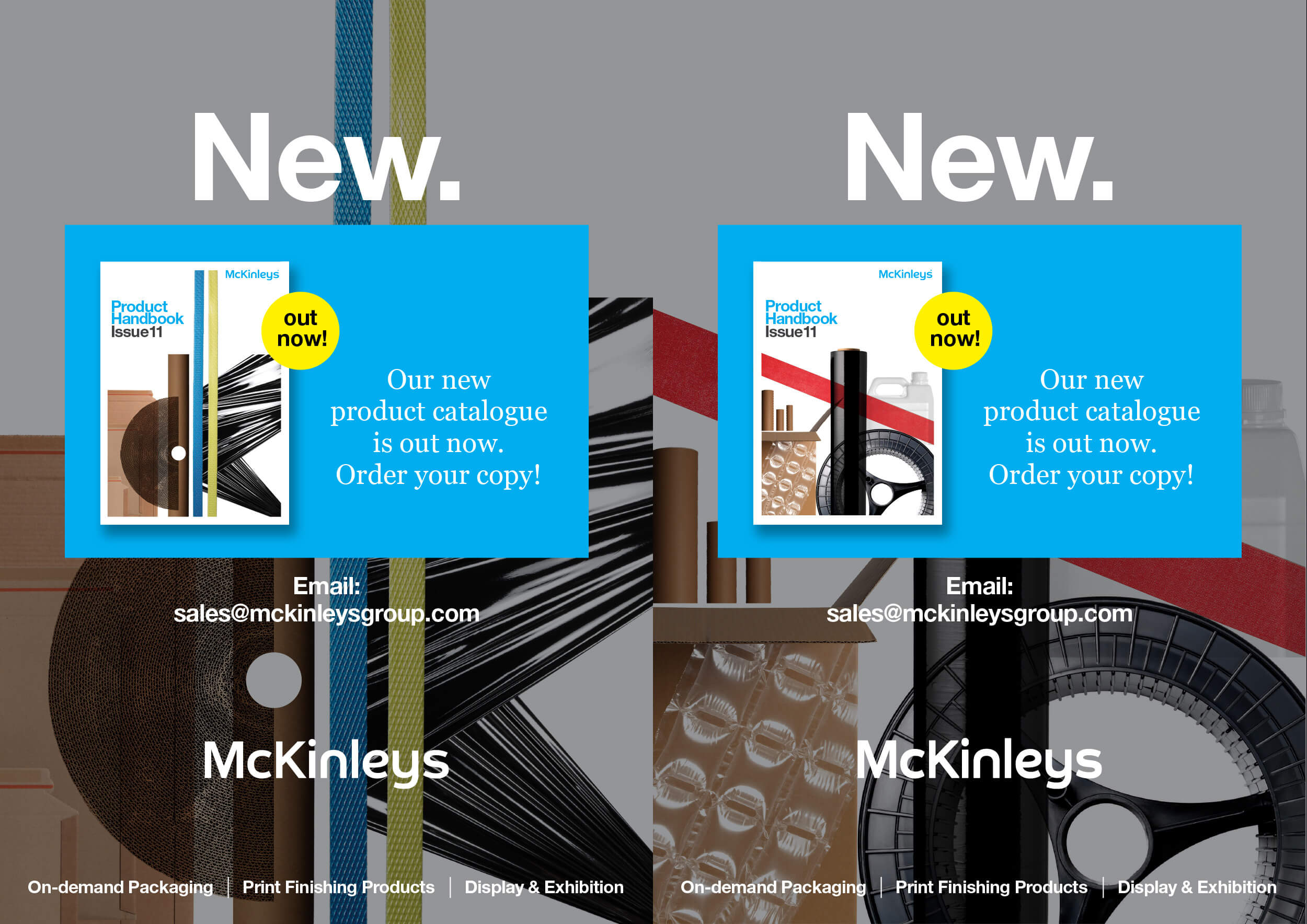
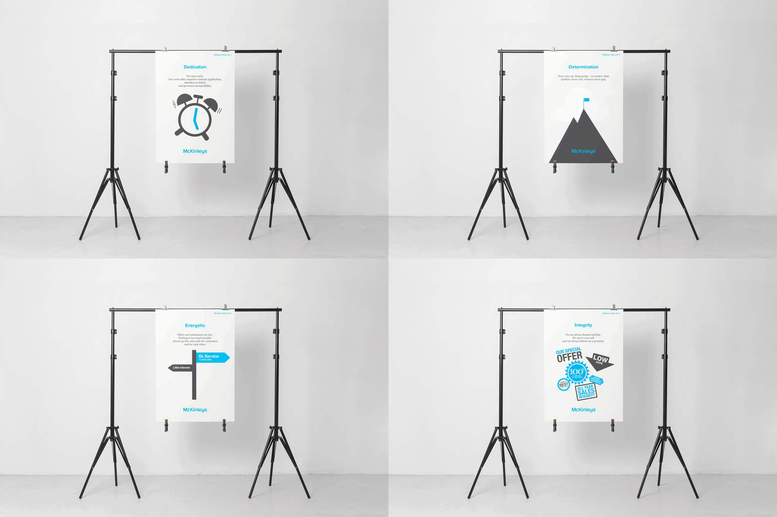
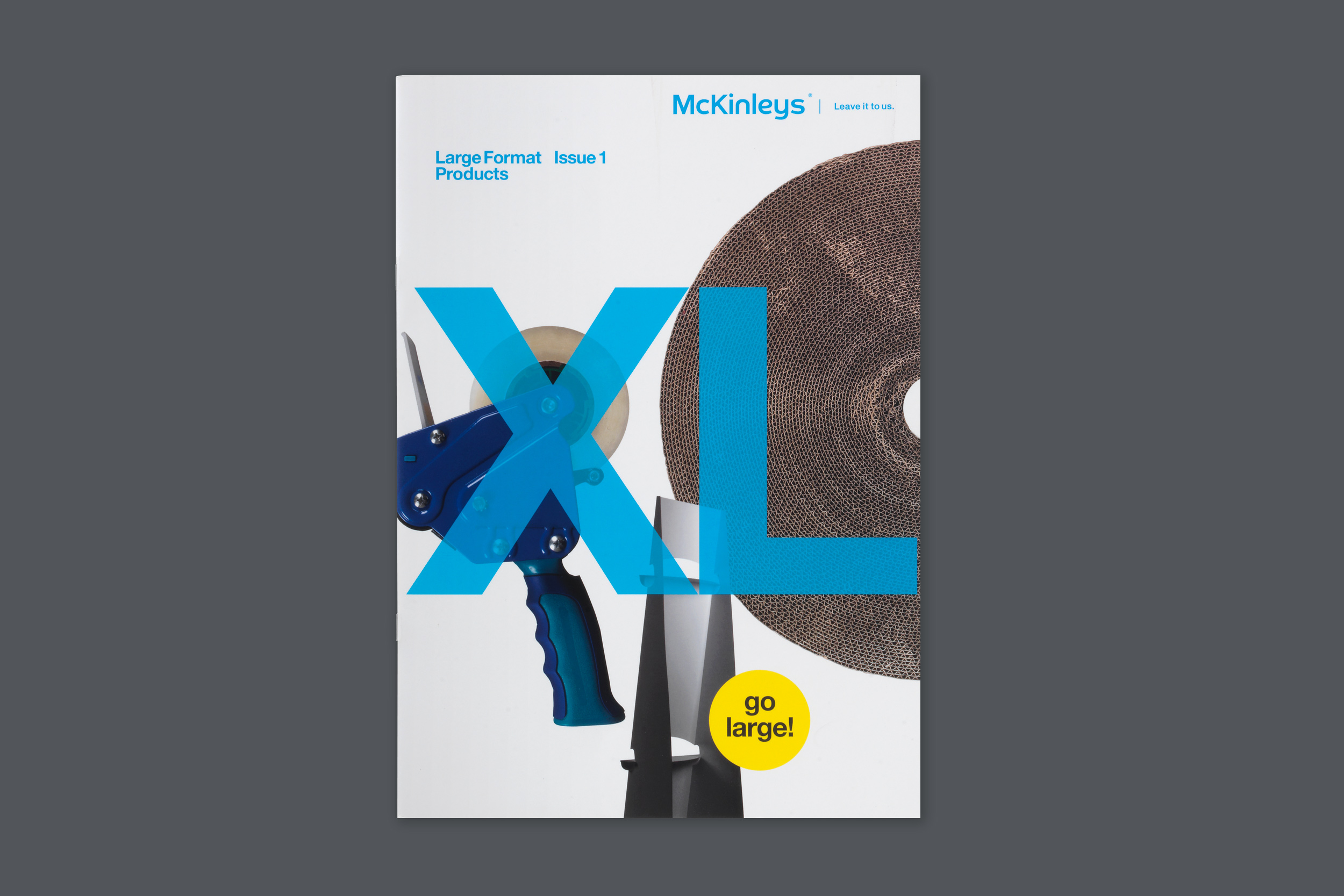
Full corporate visual identity update and brand refresh for McKinleys – a family run packaging and print finishing products firm. The update required a brand audit, the development of a new corporate strapline, defining their USPs and comm's messaging, the redesign of the corporate logo with divisional branding and then its application across stationary, internal and external signage, internal comms and promotional and marketing materials. As a graphic design agency Smith continues to provide a full ongoing design service McKinleys for both print and digital communications.
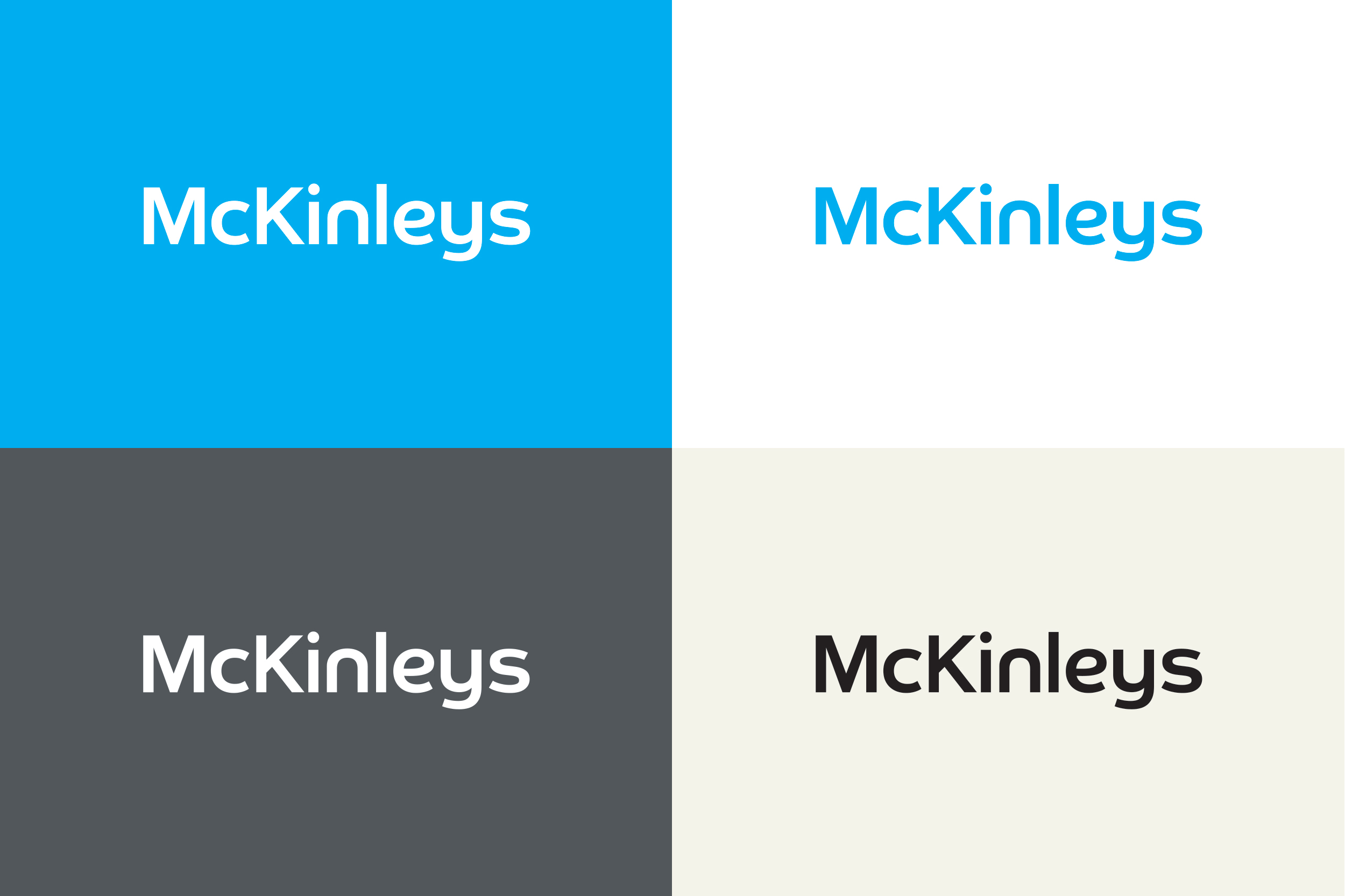
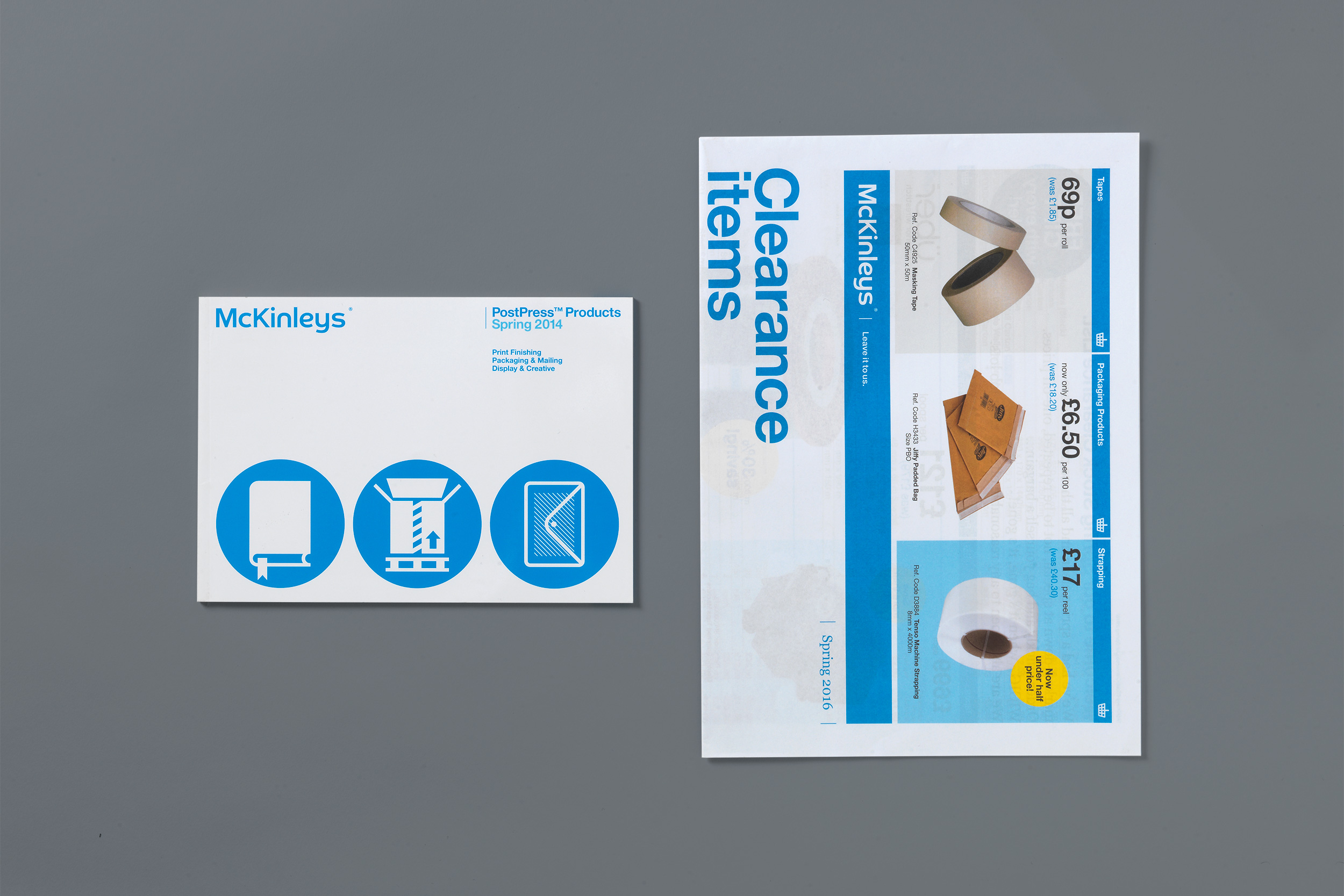
McKinleys were well established within their sector, so it was very much a case of understanding their history and strong brand values and feeding this through into the design in a way which kept certain things, evolved others whilst introducing completely new elements where needed. Smith redrew the logo - bringing it up-to-date, making it bolder and more contemporary looking - ensuring it 'read' better at small sizes. The new letterforms featured a 'smile' into the descender of the lower case 'y' letterform - to echo the firm's friendly persona, balancing the slightly more coporate feel to the logo. The corporate blue was slightly tweeked towards a brighter, cleaner cyan – refreshing the look whilst maintaining a link with the old identity.
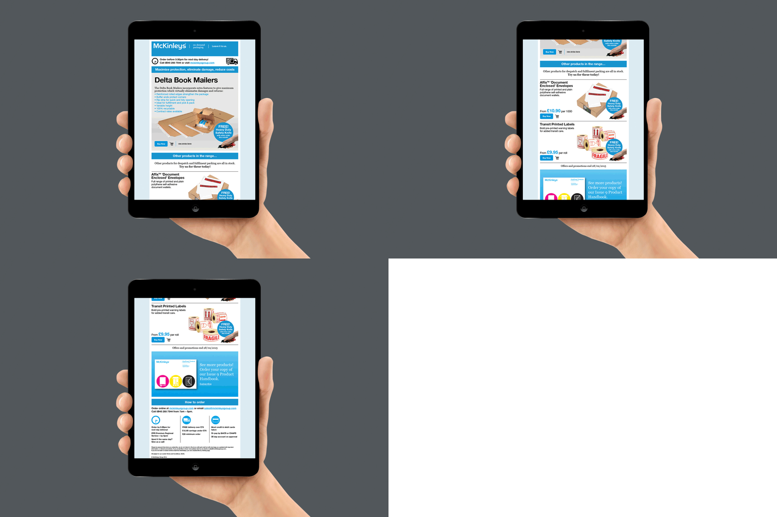
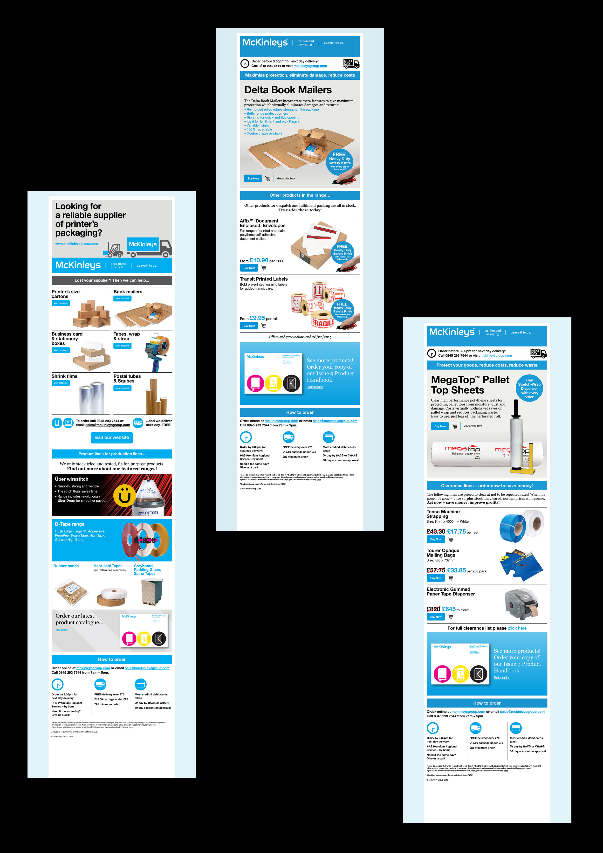
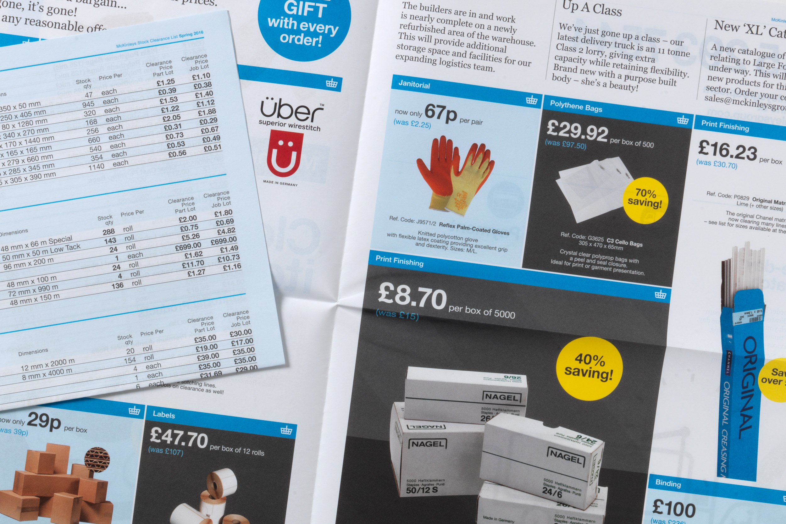
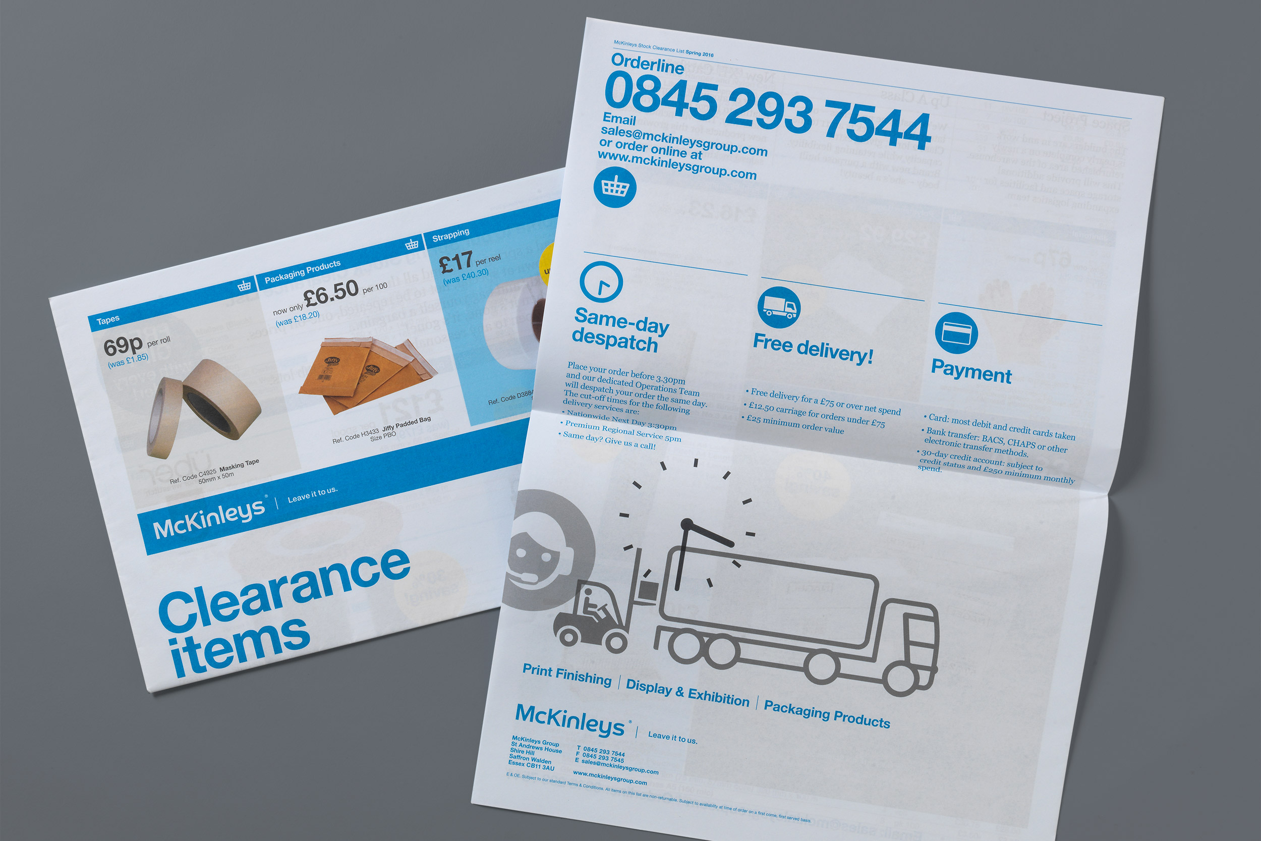
New communication materials were developed, including a quarterly broadsheet newsletter, e-shot product campaigns and the development of a number of sub-brand identities for product lines developed and distributed by McKinleys themselves. As well as doing the rebrand, Smith continues to service all of McKinleys graphic design requirements on an ongoing basis.
+

